


Role UX/UI Designer (Individual Design Exercise)
Tool Figma
Photoshop
After Effects
Procreate
Role UX/UI Designer (Individual Design Exercise)
Tool Figma
Photoshop
After Effects
Procreate
background
background
background
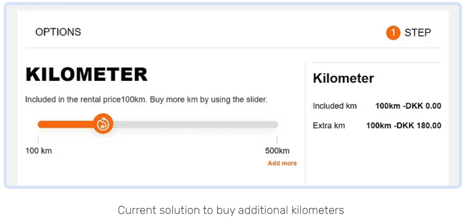
When a customer is booking a car, 100 kilometers per day is already included in the rent price. If the customer wants to drive more than 100 km per day, they can purchase “extra kilometers”.
The customer can purchase in additional batches of 100 km each.
background
When a customer is booking a car, 100 kilometers per day is already included in the rent price. If the customer wants to drive more than 100 km per day, they can purchase “extra kilometers”.
The customer can purchase in additional batches of 100 km each.
understanding
understanding
understanding
understanding
In the booking process, there is an «Extra Kilometre» calculator. However, many customers report issues with understanding it:
People with busy working hours who don’t have time for cooking
People who have children and have challenges finding different and quick meal ideas
People who don’t know how to cook anything and want to learn cooking
Problem Statement
Problem Statement
Some customers oversee than 100 km per day is already included.
Some customers don’t understand how to add more than600 km.
Some customers don’t understand d that if they select more kilometers, they will receive a discount
Some customers oversee than 100 km per day is already included.
Some customers don’t understand how to add more than600 km.
Some customers don’t understand d that if they select more kilometers, they will receive a discount
Users' Feedback
Users' Feedback
“I would like to know how many kilometers are included in my rental, so I can decide if that is a sufficient amount of kilometers for my rental or not.”
“I would like to know the price of the extra kilometers (100 km each), so I can select the amount I need for my trip.”
“I would like to understand the percentage discounts I will get when buying X kilometers, so I can understand how much I save up.”
“I would like to understand how to purchase more than 600 extra km.”
Competitive Audit
For this design exercise, a more in-depth understanding of the users’ needs should be studied through a competitive audit by observing the current market. My next step was to look at some of the existing products and see what pain points they were addressing.
I studied the pros and cons of current solutions for adding extra kilometers. Direct competitor products include:
Europcar
Sixt
Buchbinder
Autoeurope
Flizzr
I have created a table to compare the user experience of each competitor's solution and prepared a report of the data.
One common drawback of these products is that most of them don't provide different additional km options. They offer the option to pay the additional mileage fee when drop the car off.
I was also inspired by the solution of «Sixt» which provides users three options for extra kilometers including “150 km per day”, “300 km per day” and “unlimited”.
Scenario
Scenario
My first step was to provide my design with a context. To do that, I came up with the following scenario
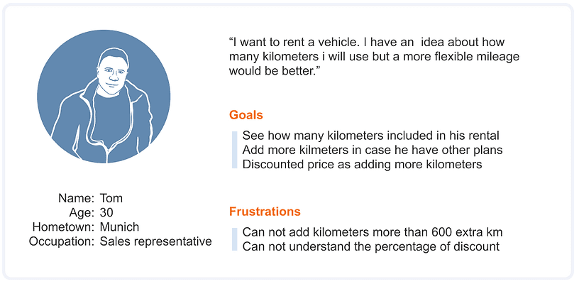
Let's name our character Tom. Tom, 30, is a sales representative, living in Munich. He wants to spend a fun day with his friend who is visiting him. He made his plans for the day and it was time to rent a car. He went to the Oscar website to rent a car, chose the car he wanted, and came to the booking screen. Tom knew approximately how much he would use the vehicle during the day, but there was still the possibility that he would go to different places than he planned. That's why he started to examine how many kilometers he could use the car he rented and his extra kilometer account. While examining the mileage information, Tom first tried to understand how many kilometers it was included in his rental. He was considering how he could get additional mileage if this included mileage was insufficient.
My first step was to provide my design with a context. To do that, I came up with the following scenario
Let's name our character Tom. Tom, 30, is a sales representative, living in Munich. He wants to spend a fun day with his friend who is visiting him. He made his plans for the day and it was time to rent a car. He went to the Oscar website to rent a car, chose the car he wanted, and came to the booking screen. Tom knew approximately how much he would use the vehicle during the day, but there was still the possibility that he would go to different places than he planned. That's why he started to examine how many kilometers he could use the car he rented and his extra kilometer account. While examining the mileage information, Tom first tried to understand how many kilometers it was included in his rental. He was considering how he could get additional mileage if this included mileage was insufficient.
user stories and personas
user stories and personas
user stories and personas
user stories and personas
Residents or tourists with a driving license who want to travel by car. I created the following persona to keep in mind:
Residents or tourists with a driving license who want to travel by car. I created the following persona to keep in mind:
DESIGN PROCESS
DESIGN PROCESS
Brainstorming & Sketching
I first started to brainstorm and roughly sketched out concepts.
In this phase, I focused on efficiently using the multiple attributes in a simple layout. I listed the basic attributes that I should use in the design and tried to combine them in various layouts.
Delıverables
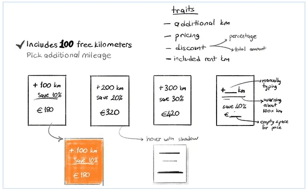
Based on user research and user pain points, the content that should be included in card components: is "additional mileage", "price" and "discount" information.
After drafting many different layouts, I picked three of them based on the pain points spotted to design in higher fidelity.
Based on user research and user pain points, the content that should be included in card components: is "additional mileage", "price" and "discount" information.
After drafting many different layouts, I picked three of them based on the pain points spotted to design in higher fidelity.
01
Pricing Card Component which is easy to compare the discount percentages.
02
The Quantity Interaction Button which is easy and worry-free
03
Slider component which is fun and similar to the current solution of the company
01
Pricing Card Component which is easy to compare the discount percentages.
01
Pricing Card Component which is easy to compare the discount percentages.
02
The Quantity Interaction Button which is easy and worry-free
02
The Quantity Interaction Button which is easy and worry-free
03
Slider component which is fun and similar to the current solution of the company
03
Slider component which is fun and similar to the current solution of the company
DESIGN ALTERNETIVES
DESIGN ALTERNETIVES
DESIGN
ALTERNETIVES
DESIGN ALTERNETIVES
01 Pricing Card Component
01 Pricing Card Component
Schneiderman's Mantra:
-Overview first, zoom and filter, then details-on-demand
Schneiderman's Mantra was one of the key design principles which helped me to decide to combine the information and develop a logic among them.
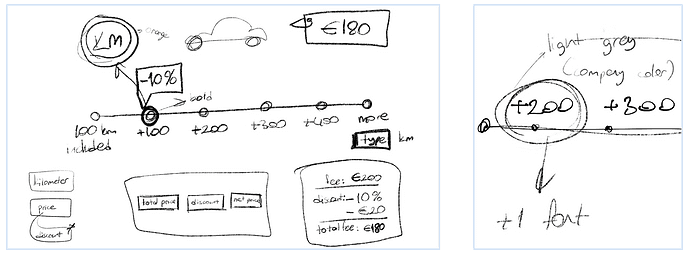
I constructed the following layout which includes the color palette and design approach of the company in first sight and felt complete in data attributes and logic in the user flow. I produced the following design alternative as a kick-start:
Schneiderman's Mantra:
-Overview first, zoom and filter, then details-on-demand
Schneiderman's Mantra was one of the key design principles which helped me to decide to combine the information and develop a logic among them.
I constructed the following layout which includes the color palette and design approach of the company in first sight and felt complete in data attributes and logic in the user flow. I produced the following design alternative as a kick-start:
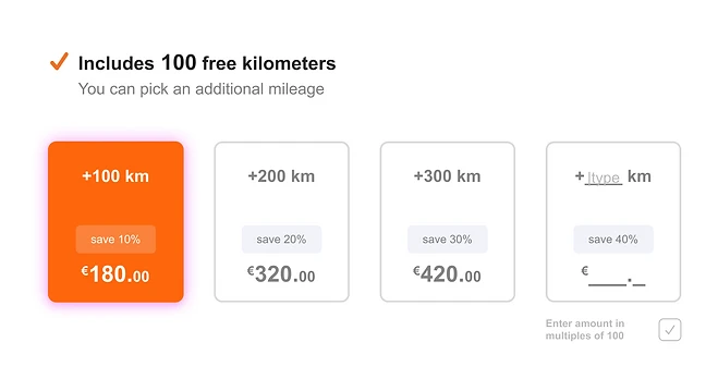
The main aim is providing the different additional mileage options to users on a single layout.
Users can pick the additional kilometer card as they wish.
The main aim is providing the different additional mileage options to users on a single layout.
Users can pick the additional kilometer card as they wish.
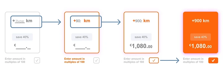
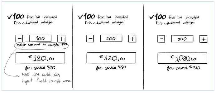
In addition, they can type the amount, if they want to buy more than 400 kilometers. They only can enter the amount in multiples of 100. When they enter a valid number (multiple of 100) the approval button is activated.
What if they don’t want to add more??
In addition, they can type the amount, if they want to buy more than 400 kilometers. They only can enter the amount in multiples of 100. When they enter a valid number (multiple of 100) the approval button is activated.
What if they don’t want to add more??

Then I tested the design with family members. and I noticed that there is no "continue without adding mileage" option. This was the field where I should upgrade the design accordingly.
Then I tested the design with family members. and I noticed that there is no "continue without adding mileage" option. This was the field where I should upgrade the design accordingly.
Craig Simpson asked that “Dollar Off or Percent Off?”
In general, the offer that sounds higher is the one that does best.
Let’s simplify that a little bit more:
In general, the offer with a larger number (whether it’s a dollar amount or a percentage) is the one that does best.
Craig Simpson asked that “Dollar Off or Percent Off?”
In general, the offer that sounds higher is the one that does best.
Let’s simplify that a little bit more:
In general, the offer with a larger number (whether it’s a dollar amount or a percentage) is the one that does best.
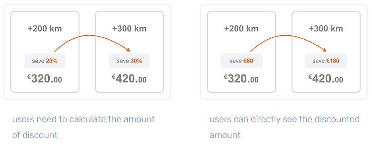
I created two different UX writing for the cards, as you can see. Due to the time constraint, I was not able to conduct full user testing for this design exercise. You can see and compare the effect of each card on the user's psychology as a part of the testing:
Combining the design alternatives and testing results
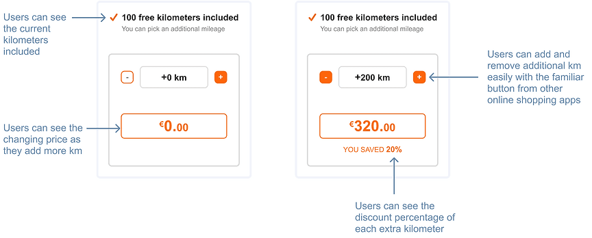
Based on the user testing and the articles, I decided to improve the initial UX solution for a better one. When users want to add more then 400 kilometers, they can use the “+” button. Also the users can easily reduce the amount of additional kilometers with “-” button.
I created two different UX writing for the cards, as you can see. Due to the time constraint, I was not able to conduct full user testing for this design exercise. You can see and compare the effect of each card on the user's psychology as a part of the testing:
Combining the design alternatives and testing results
Based on the user testing and the articles, I decided to improve the initial UX solution for a better one. When users want to add more then 400 kilometers, they can use the “+” button. Also the users can easily reduce the amount of additional kilometers with “-” button.

01 Pricing Card Component
02 Quantity Interaction Button
I think the biggest advantage of this design is that it provides the most simple solution to resolve the issue. Using “add/remove” buttons is a familiar way for users to purchase products online. So I think using these buttons to add extra kilometers makes users feel more comfortable.
I think the biggest advantage of this design is that it provides the most simple solution to resolve the issue. Using “add/remove” buttons is a familiar way for users to purchase products online. So I think using these buttons to add extra kilometers makes users feel more comfortable.

02 Quantity Interaction Button
02 Quantity Interaction Button
I also created a version with the “discounted price” to compare its effect on users. Because users may not think that there is much difference between 20% and 30% discount. However, when they see the actual discount amount as the percentage increases, they may understand the difference more clearly.
I also created a version with the “discounted price” to compare its effect on users. Because users may not think that there is much difference between 20% and 30% discount. However, when they see the actual discount amount as the percentage increases, they may understand the difference more clearly.
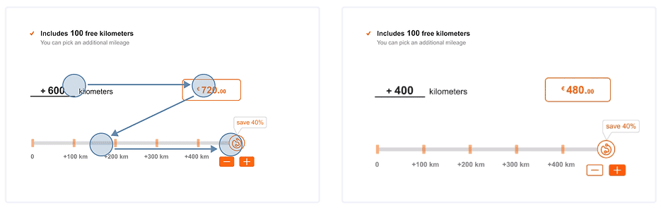
03 Slider Component
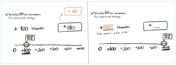
An updated slider component is the most similar solution to the current one. Using a bar is a fun way to add more mileage and see the different pricing and discount alternatives. So I created three design alternatives for a slider component.
First version of slider
I think using these buttons to add extra kilometers makes users feel more comfortable. In addition, I should have added the discount percentage for each additional kilometer amount to be more understandable.
First version of slider
I think using these buttons to add extra kilometers makes users feel more comfortable. In addition, I should have added the discount percentage for each additional kilometer amount to be more understandable.
02 Quantity Interaction Button
03 Slider Component
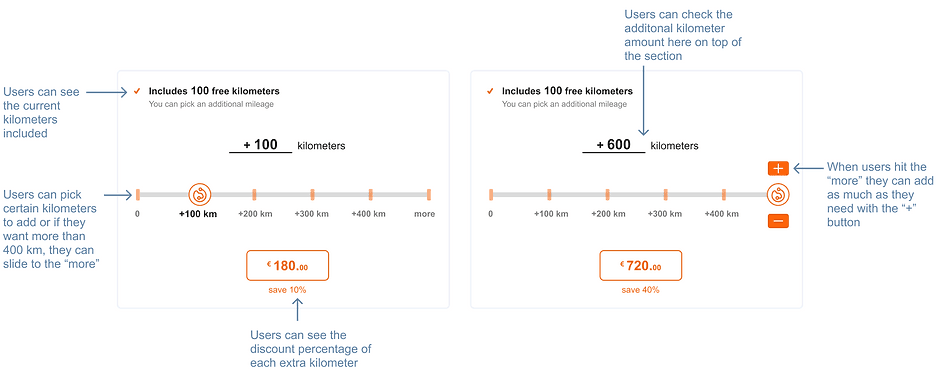
Second version of slider
For the second design alternative, I tried to add more friendly elements. I aimed to communicate with users in a warmer way to inform them about discounts. Also I used the Z pattern layout plan. Its design mimics the route the human eye travels when it reads — left to right, zigzagging top to bottom. So, users first scan from the top-left to the top-right, forming an imaginary horizontal line.

Third version of slider
The third design alternative is a similar version of second one to be tested. I wanted to include “typing” section to buy more additional kilometers. I haven’t tested the product with a large number of users, so I need to conduct research to determine the most useful version for the users.
If users want to add +1000 kilometers more, and if they don’t feel comfortable by clicking the “+” button 6 times, they may want to type the exact amount of the kilometer at once. I also studied this alternative in order not to cause a bias.
First version of slider
I think using these buttons to add extra kilometers makes users feel more comfortable. In addition, I should have added the discount percentage for each additional kilometer amount to be more understandable.
03 Quantity Interaction Button
Second version of slider
For the second design alternative, I tried to add more friendly elements. I aimed to communicate with users in a warmer way to inform them about discounts. Also I used the Z pattern layout plan. Its design mimics the route the human eye travels when it reads — left to right, zigzagging top to bottom. So, users first scan from the top-left to the top-right, forming an imaginary horizontal line.
An updated slider component is the most similar solution to the current one. Using a bar is a fun way to add more mileage and see the different pricing and discount alternatives. So I created three design alternatives for a slider component.
Third version of slider
The third design alternative is a similar version of second one to be tested. I wanted to include “typing” section to buy more additional kilometers. I haven’t tested the product with a large number of users, so I need to conduct research to determine the most useful version for the users.
If users want to add +1000 kilometers more, and if they don’t feel comfortable by clicking the “+” button 6 times, they may want to type the exact amount of the kilometer at once. I also studied this alternative in order not to cause a bias.
An updated slider component is the most similar solution to the current one. Using a bar is a fun way to add more mileage and see the different pricing and discount alternatives. So I created three design alternatives for a slider component.
03 Slider Component
ISecond version of slider
For the second design alternative, I tried to add more friendly elements. I aimed to communicate with users in a warmer way to inform them about discounts. Also I used the Z pattern layout plan. Its design mimics the route the human eye travels when it reads — left to right, zigzagging top to bottom. So, users first scan from the top-left to the top-right, forming an imaginary horizontal line.
First version of slider
I think using these buttons to add extra kilometers makes users feel more comfortable. In addition, I should have added the discount percentage for each additional kilometer amount to be more understandable.
Third version of slider
The third design alternative is a similar version of second one to be tested. I wanted to include “typing” section to buy more additional kilometers. I haven’t tested the product with a large number of users, so I need to conduct research to determine the most useful version for the users.
If users want to add +1000 kilometers more, and if they don’t feel comfortable by clicking the “+” button 6 times, they may want to type the exact amount of the kilometer at once. I also studied this alternative in order not to cause a bias.
PROTOTYPE
PROTOTYPE
PROTOTYPE
PROTOTYPE
You can try out the process and compare the three design alternatives in the interactive prototype built with Figma.
You can try out the process and compare the three design alternatives in the interactive prototype built with Figma.
You can try out the process and compare the three design alternatives in the interactive prototype built with Figma.